OOO brand update
OOO brand update
“living document” - to be built and edited through discussion. will catalog the design process.
27 AUGUST 2023
Suggested Next Steps
Define:
About Us - Background
Brand Values/Identity/’Mission’
Brand Voice
Refine:
Logo
Spacing, kerning, specs, angles etc.
Define do’s and dont’s
Use Cases
Color Palette
Overall palette options to pull from
Typography
Various font families that we’ll use, and when
Asset List:
Needs
Wants
Create
Brand guidelines deck
Corresponding new release artwork
Radio content
Playlist artwork
Merch Art/Drafts/Ideas
Elliott Note: Defining the abstract things early, like a mission or brand voice, will help keep the aesthetic within a loose (and flexible) box. Knowing how OOO sounds or presents itself as an idea will make knowing how to present it visually in a clear a consistent way over time.
It doesn’t have to be prophetic or intense. Just clearly defined.
Elliott Note: This will set us up to build our a brand guideline deck/book, and make it easier for anyone to implement the logo(s) when we send it off for anything like fliers, ad mats, digital promotions.
Elliott Note: Example of current needs. Things to add? Teaser content, Apple Music Animations etc.?
Elliott Note: listing out the family of assets/needs/wants should follow the defined brand-ID, so everything is created in a similar fashion - ideally everything feels related and connected.
8/29 Weekly Design Sync
Issue: LED Arms Race - more complicated race to nothing - avoid this!
Label direction should influence the future of Otto’s design direction. Establish both and relate the 2, but don’t make them the exact same..
One asset would love to use, is an artist photo with some sort of filter.
Photo edits, Otto only clients wouldn’t like the press edits as much.
50’s cut out collage is over done. use the reference for vibe.
open to having different interpretations of the OOO logo, especially with varying artists (visual). slight alterations. edits.
a key theme being discussed is variety. adaptability.
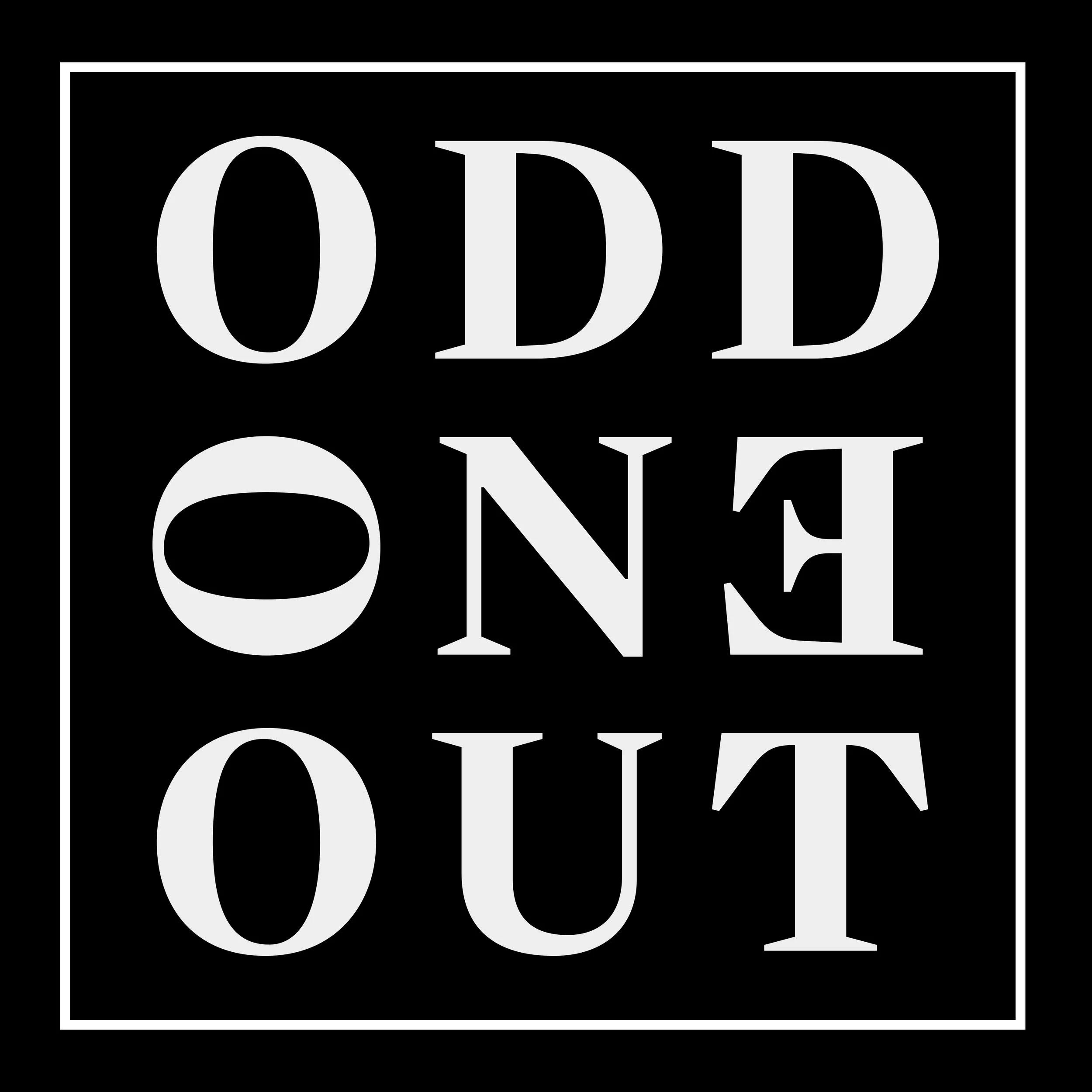
symbolism, odd one out. isolate color to identify as signature. if we go with a minimal vibe with the colors.
bold colors.
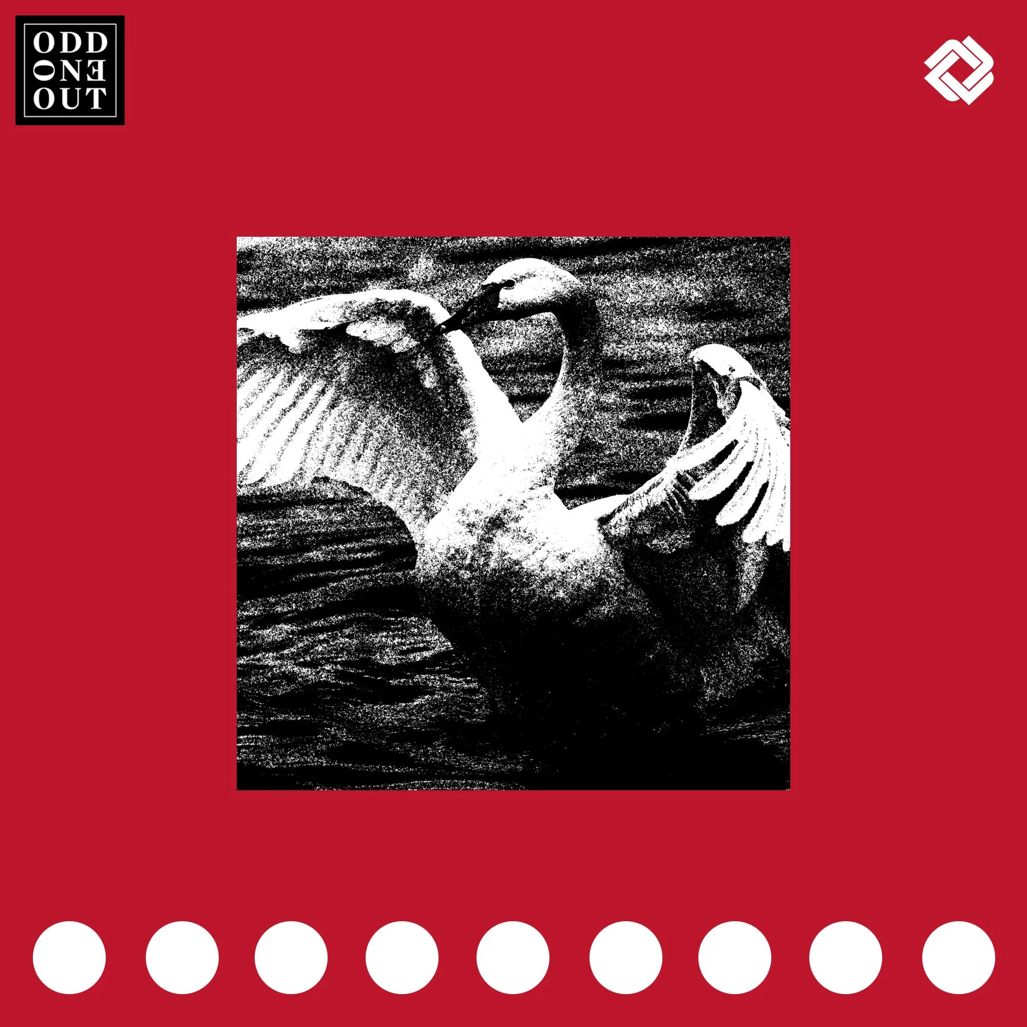
OOO Release System: Information/Icon focused
Modular Model Concept (All examples for illustrative/discussion purposes only, to align on layout and elements to then design)
3x3 grid broken to isolate specific informationo
Checkerboard elements are to illustrate grid spacing, not necessarily what is included as part of the artwork.
Mid sized OOO Logo + “easter egg icons”, “Odd Sequence”, extra large release counter
Icons TBD. Using feathers right now for quick fill, could be related to art, could be something else for a more abstract system
OOO Release System: Art Focused
Bold Color Forward
9x9 even grid with margin, evenly sized icons, stamp maintains top left, special icon top right (changes), “odd sequence” changes at bottom (what it indicates is TBD)
Each block in the 3x3, is further subdivided into smaller evenly sized 3x3 blocks.
Large OOO Logo, OOO Flip Card for artist and title, standard art size, long “odd sequence” at base
Can be reconfigured to prioritize difference information
Bonus:
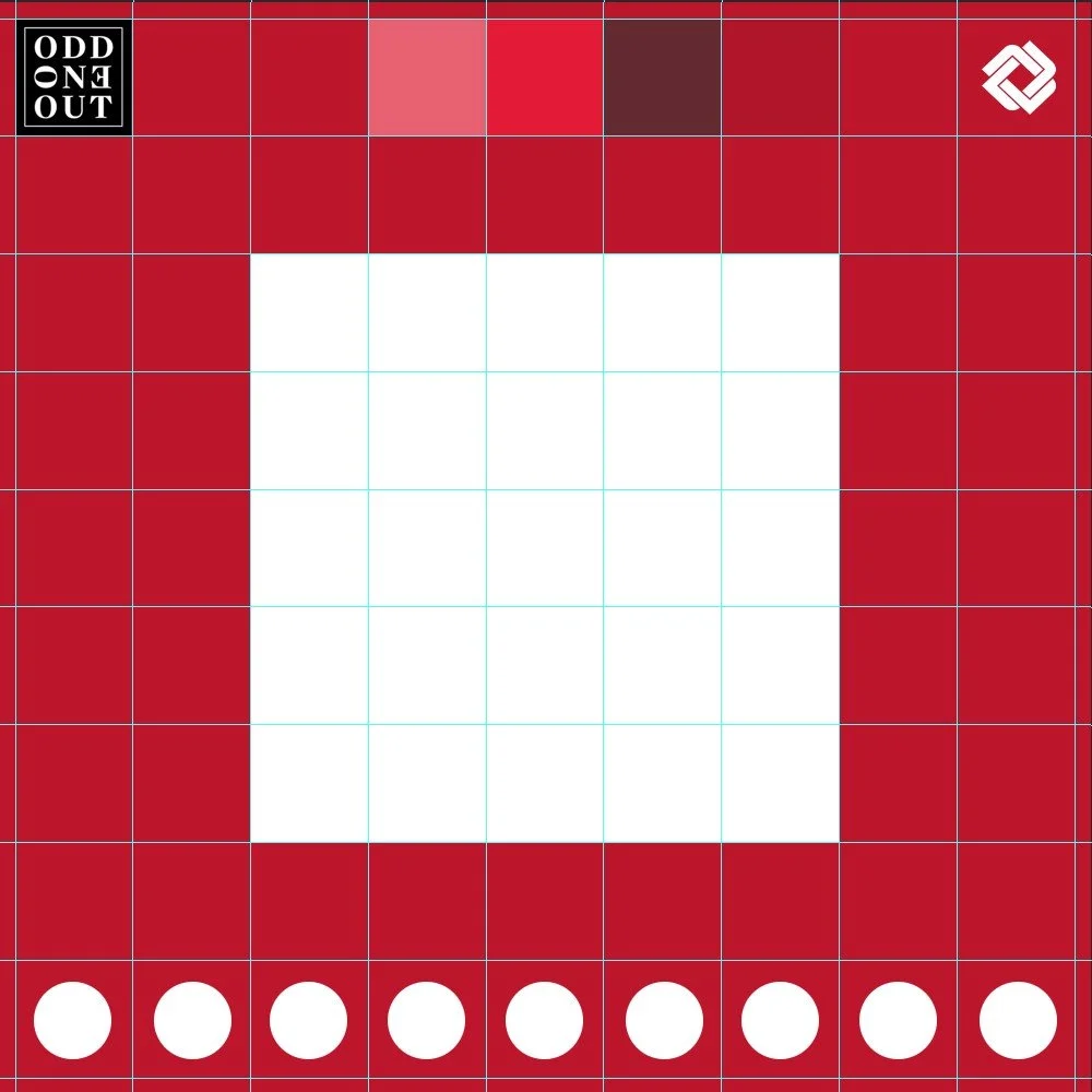
Could easily integrate a color palette block
What’s in Market (CONTEXT)
Bold Color Centralized
Develop an alternative border identity, does not have to be this roughly textured look. Just focuses on isolating the bold color to a more central space
